In the heart of every revolution lies a symbol of change—a beacon that guides us forward, embodying our aspirations, our dreams, and our journey. For Kustomer, that symbol has always been more than just a logo; it’s a statement, a promise, a commitment to excellence in customer service.
Today, we’re thrilled to share with you a milestone in our journey: the unveiling of our new Kustomer logo. This isn’t just a redesign; it’s a reimagining of what our brand stands for, reflecting our unwavering dedication to transforming customer experiences.
A Logo Reborn: Unveiling Our New Identity
Our journey has been nothing short of epic, and as we’ve navigated the changing tides of the customer service landscape, we’ve evolved. It’s time our logo did the same.

We embarked on this journey with a vision: to create a logo that captures the essence of Kustomer—the innovation, the warmth, the unwavering commitment to our customers. But how do we visualize such profound concepts? How do we encapsulate the soul of Kustomer in a simple design?
The answer was clear—focus on the heart of our mission: the customers, utilizing AI as our tool to craft a logo that truly resonates. Our new logo is a testament to our journey, a blend of simplicity and sophistication. It’s more than just a symbol; it’s a beacon of hope and innovation in the realm of customer service.
Inspiration Behind the Design
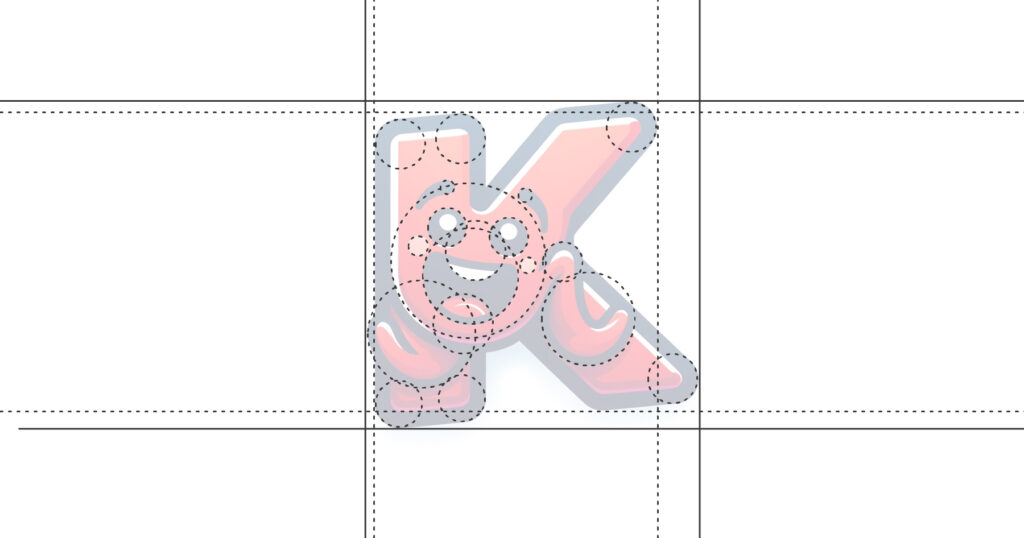
Our design process was driven by three guiding principles: simplicity, adaptability, and humanity. We wanted a logo that’s not only visually appealing but also deeply meaningful.

- Simplicity: In a world cluttered with noise, we sought clarity. Our new logo stands as a beacon of simplicity, guiding the way to effortless customer service.
- Adaptability: The new Kustomer logo thrives in every space—digital or physical, big or small. It’s designed to be as versatile and dynamic as the service we provide.
- Humanity: At its core, Kustomer is about connections. Our logo reflects this, with a design that’s warm, inviting, and unmistakably human.
The “K” That Connects Us
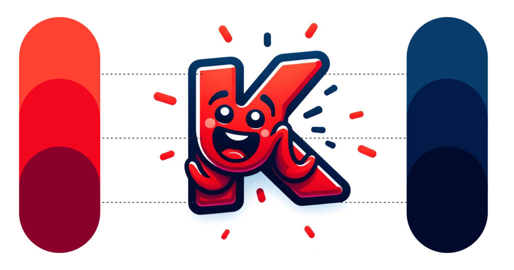
The centerpiece of our new logo is the “K”—a symbol of knowledge, kindness, and the key to unlocking unparalleled customer experiences. It’s a reminder that at the heart of every interaction, every solution, every moment of delight, there’s a human touch.
This “K” isn’t just a letter; it’s our ethos, our emblem, our north star. It stands tall, proud, and brimming with the promise of what’s to come. It invites you into our world—a world where customer service transcends expectations, where every interaction is an opportunity to inspire, to connect, to transform.

A Future Forged Together
As we step into this new chapter, our new logo is more than just a change of design. It’s a commitment to you, to our community, to the world. It’s a pledge to never stop innovating, to never stop caring, to never stop striving for excellence.
Join us as we embark on this exciting journey. Together, under the banner of our new logo, we will set new standards, push boundaries, and redefine what it means to provide exceptional customer service.

